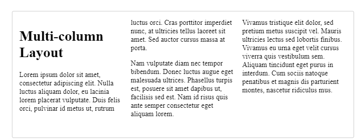
Multi-Column Layout
Created: 2022-11-28
.container {
column-width: 200px;
}
The browser creates as many 200 pixel columns as will fit.
Whatever space is left between the columns will be shared.
Three Column Layout
.container {
column-count: 3;
column-width: 200px;
}
Styling Columns
The columns created by multicol cannot be styled individually.
There's no way to make
- one column bigger than other columns
- or to change the background
- or text color of a single column.
Two opportunities to change the way that columns display:
- Changing the size of the gap between columns using the
column-gap. - Adding a rule between columns with
column-rule.
.container {
column-count: 3;
column-gap: 20px;
column-rule: 4px dotted rgb(79, 185, 227);
}
column-rule is a shorthand for
column-rule-color,
column-rule-style,
column-rule-width,
and accepts the same values as border.
Spanning in between columns
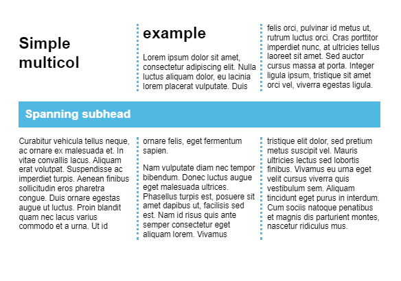
To cause an element to span all the columns,
specify the value of all for the column-span property.
It isn't possible to cause an element to span just some columns.
The property can only have the values of none (which is the default) or all.
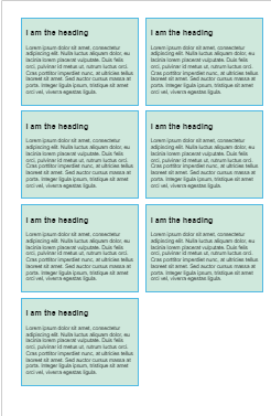
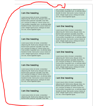
Columns are fragmented
To fix this
To control this behavior, we can use properties from the CSS Fragmentation specification.
This specification gives us properties to control the breaking of content in multicol and in paged media.
For example,
-> by adding the property break-inside with a value of avoid to the rules for .card.
.card {
break-inside: avoid;
page-break-inside: avoid;
background-color: rgb(207, 232, 220);
border: 2px solid rgb(79, 185, 227);
padding: 10px;
margin: 0 0 1em 0;
}